Economically, putting magnitudes on preferences (cardinal utility) is something that has been recognized as fruitless for some time, although political scientists and psychologists still try to do so. This leads to the crux of the various "impossibility theorems" in the various critiques of the notion of "social welfare" in economics.
Inter-personal comparisons of "utility" or magnitudes of preference in a survey like the Compass requires me to assume that both people know what is meant by "Agree" as opposed to "Strongly Agree" in the Likert Scale, that they agree on that meaning, and so on. Usually, people don't agree on the intensity meant by "Strongly" in these surveys and the study faces the problem of not having "Inter-Rater Reliability." For a statement like, "If economic globalisation is inevitable, it should primarily serve humanity rather than the interests of trans-national corporations," it can be hard to have strong feelings for or against because "serve humanity" can mean different things to different people. Also, are the interests of "humanity" and "corporations" necessarily conflicting? I put "agree" on this because I think that freer trade and factor movements do serve humanity even if they serve corporations in the process. How intensely to I believe this? I guess pretty strongly, but the loadedness of the question makes me tentative.
My suggestion for the authors would be to make the survey binary - "agree" or "disagree." That way, their index would map to a well-defined and well-calibrated as a ratio-scale varilable. The current scale for the responses maps to a poorly calibrated interval-scale variable (and probably give a better dispersion of views for comparisons. Here are some pictures of their comparisons of various leaders:
Leaders:
 2008 US Presidential Candidates:
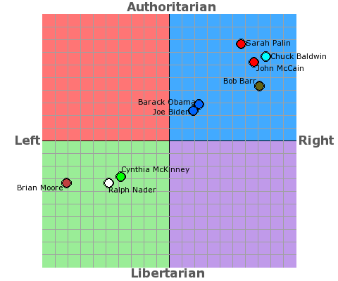 2004 Presidential Candidates:
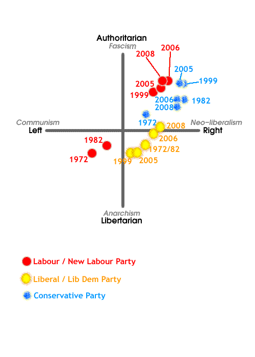
 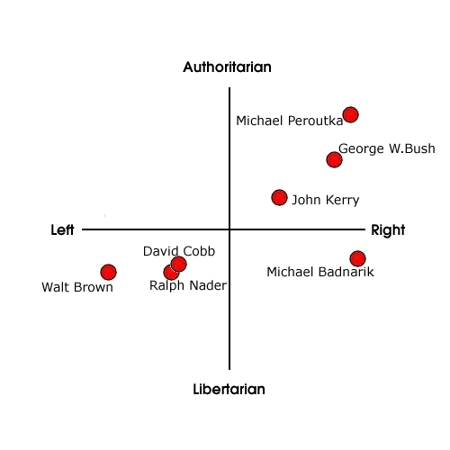 UK Political Parties (Current and Over time):
No comments:
Post a Comment